1. HTML Fundamentals #
HTML: Hypertext Markup Language. Hypertext, meaning text that can be shown on an electronic device that includes links to other text. Markup Language, meaning a language that can be interpreted by a program to style the text.
HTML is the standard markup language for documents sent over the World Wide Web and is interpreted by web browsers such as Google Chrome, Microsoft Edge, and Mozilla Firefox. Though its primary use is for making web pages, HTML can be used to markup any document much like Microsoft Word, or Apple's Pages.
HTML is written using basic building blocks called elements. An element describes where specific HTML areas start and end. These elements include visual components such as paragraphs and headings, as well as non-visual components such as metadata; information about the document. Elements typically include tags that indicate where an element begins; called a "start tag", and where an element ends; called an "end tag". Elements may contain attributes that can be used to modify their behavior. These attributes typically have an attribute name that describes what will be modified and an attribute value that describes the modification. Many elements contain content which is the part of the element that is displayed. Elements that do not contain any content are called "void" elements.
1.1 Construct markup that uses metadata elements #
- script/noscript: script and noscript elements allow the use of programming code to be written into the document. While, technically the script element supports any language, most browsers only support JavaScript. This exam does not assess any knowledge of JavaScript so we'll only cover a simple example here. The alert function in JavaScript tells the browser to pop up an alert message, and this was written into the script element in the example below. The noscript element allows us to show a message if the user's browser does not support scripts or has scripts disabled. This is also demonstrated in the example below.
- style: The style element allows us to write styling rules into the document. The "style" element always goes inside the "head" element. These rules are written in a language called CSS that we will cover in more detail later. For now, review the simple example below.
-
meta: "meta" elements allow
us to define the metadata (data about data) for our
document. The "meta" element always goes inside the "head"
element. Review the example below, then a breakdown of
common "meta" element attributes will follow. Notice that
the "meta" elements are void elements and thus have a start
tag, but no end tag.
- Encoding: On line two of the example above, you'll see a "meta" element with an attribute name of "charset" and an attribute value of "utf-8". "charset" allows us to set what character encoding standard we'd like to use for our document. Don't worry if that sounds a little complicated. utf-8 is the modern encoding that most web pages use as it supports nearly all of the languages and special characters/symbols you would ever need to display.
- keyword: On line three of the example above, you'll see a "meta" element with an attribute name of "name" and a value of "keywords". This sets this "meta" element up to describe which keywords can be used to find this page using a search engine such as Google, Bing, or DuckDuckGo. Following the "name" attribute is the "content" attribute. Inside of the value for this attribute we can write a list of keywords (separated by commas), that can help search engines connect our page with users that search for those words.
- description: On line four of the example above, you'll see a "meta" element with an attribute name of "name" and a value of "description". This sets this "meta" element up to give search engines a brief description of our page that can be displayed when someone searches for our site. The description text is written in the value area of the "content" attribute.
- viewport: On line five of the example above, you'll see a "meta" element with an attribute name of "name" and a value of "viewport". This sets this "meta" element up to tell the browser how we'd like to configure the viewable area of the page. Here, we set the "content" attribute to "width=device-width, initial-scale=1.0". That looks very complex, but all it does is set the width of the web page to the width of the browser.
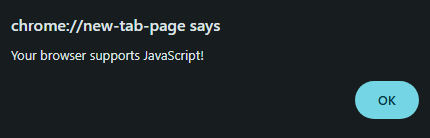
Hello, world!
1.2 Construct well-formed page markup #
- !DOCTYPE declaration: While it looks like an element the !DOCTYPE declaration stands outside of the html code and tells the browser what type of document you are writing. For our purposes, this will always be set to html and will look like the example below.
- html: The "html" element designates the root of the document and holds all of the html code inside of it. The "html" element commonly includes the "lang" attribute which holds a language in its value. To specify that our page is written in American English, we'll use the "en-US" language code in the example below.
- head: The "head" element, as we've seen earlier, holds the metadata for the document. We have already seen "meta" and "style" written in "head", but there is one more that is very common. In the example below we will see how the "title" element is used to give the document a title that is displayed in the browser's tab.
- body: The "body" element designates the start and end of the visible area of the document. Elements that display visual content go inside of "body". In the example below we will use the "h1" heading element to show how they are written.
- Proper Syntax: Syntax refers to the specific order and placement of words and symbols. Compared to other programming languages, HTML is very forgiving of syntax mistakes. Of course, that is no excuse for sloppy programming. Start and end tags should be surrounded by opening angle brackets (<) and closing angle brackets (>). Attribute values should be surrounded in double-quotes ("). Nesting is the act of writing one element inside of another. The "head" and "body" elements are nested inside of the "html" element. Nested elements should be indented to visually show they exist inside of their parent element. Finally, tag and attribute names should always be written in lower case. See the example below for the proper syntax of the minimum HTML required for web page according to HTML5 standards.
- End Tags: Not all elements have end tags. As we've seen in previous examples, the "meta" element does not have an end tag. So, when does an element need an end tag, and when doesn't it? The short answer is: an element does not have an end tag if it cannot have any content. In the example below we will see the line break, "br", element. Because this element cannot have any content, it does not use an end tag.
- Commonly Used Symbols: Some symbols cannot be written in the content area of a visual element without being confused for html code. > and < are used to surround elements and we must use a different method to get them to display on screen. For this we use entities, also known as escape codes to get these symbols to show correctly. Entities are also useful for symbols that we'd like to display, but are not on standard keyboards such as ©, ®, and ¢. The example below shows some common symbols and their entities in action.
Hello!
Line one,
Line two,
Line three.
2 > 1
BAND-AID®
The Lord of the Rings © 1954
The gum was 50¢.
2. CSS Fundamentals #
CSS: Cascading Style Sheet, is a programming language for styling markup. CSS allows us to completely change the presentation of elements in an HTML document including, but not limited to, their color, size, and position.
CSS is written using basic building blocks called rulesets. A ruleset consists of one or more selectors which designate what element in the document will be affected. In figure 2-a above, we can see that the selector is the "body" element, so everything in the body will be affected. Next, you'll see a property is declared. A property is the feature of the element that will be affected. In the figure above, we chose "color" which means the color of the text will change. Finally, you'll see a value is chosen. A value is the aspect of the feature that will be affected. In the figure above, we chose "cyan" which means all of the text in the body will be colored cyan.
2.1 Analyze and implement inline styles, internal (embedded) style sheets, and external style sheets #
-
Stylesheets: A series of CSS
rulesets are called a stylesheet. Stylesheets can be written
into an html document in three places. One, directly into an
element using the "style" attribute. This is known as
inline. Two, in the "head"
element, using the "style" element. This is known as
Internal. Three, in a
separate file. This is known as
external. Let's take a look
at the example below where all three techniques are used and
then break them down one by one.
Heading 1
Paragraph 1
Paragraph 2
- Inline: On line 17 in the top-left example above, we can see the inline style being applied. Notice that it is written inside an attribute named "style". It does not need a selector because it is written directly into the element that it will be styling.
- Internal: On lines 6 - 10 in the top-left example above, we can see the internal style being applied. Notice that it is written inside an element with the tag name "style", and the ruleset is indented to make it easier to read.
- External: On line 5 in the top-left example above, we see a new element called "link". This allows our HTML document to communicate with other files. In this case we are linking to a CSS file that we named "style.css". The code for this file can be seen in the top-right example above.
- Precedence: If we take a look at the bottom window of the example above, we can see that some stylesheets overwrite others. Even though we wrote in the external stylesheet for everything in the "body" element to be blue, only the "h1" element actually displays as blue. This is because external sheets have the lowest precedence i.e. rank. The first paragraph element is colored magenta because it was styled in the internal stylesheet, which has precedence over the external stylesheet. Finally, the second paragraph element displays as green because it was styled inline which has the highest precedence.
2.2 Construct and analyze rule sets #
- Valid Syntax: As we learned with HTML, syntax is the specific order and placement of words and symbols. CSS, like HTML has standard syntax that we must follow closely. See the example below, between lines 5 and 19, for properly written CSS.
-
Selectors: Selectors in a
ruleset are used to specify the part of the document you'd
like to style. Refer to the example code above for the
explanations below.
- Element: On line 6 in the example above, we see an element selector being used. Any html element can be used as a selector to style everything contained within that element. Here, we used the paragraph, "p" element to make all of the text in every "p" element green.
- Class: A class is an HTML attribute that allows us to give an element a name. This name can than be used as a CSS selector in a ruleset to style only the elements that share that class. On line 10 we used a class called alert by typing "p.alert" to make every "p" element with that class name have a red background and yellow text. On line 29, we gave a "p" element the "alert" class name by writing the "class" attribute name and giving it the value of "alert". Class names are case-sensitive, meaning that "alert" is different from "Alert".
- ID: An ID is similar to a class, but no element on a page can have the same exact ID name. Each ID name on a page must be unique. On line 15 we used an ID called upside-down by typing "#upside-down" as the selector. We used the "transform" property with a value of "rotate(180deg)" to flip the element we give this ID upside down. On line 32 we gave the "p" element the "upside-down" ID by typing the "id" attribute name and giving it a value of "upside-down."
- Pseudo-Class: A pseudo-class selector allows us to style a part of the page based on specific events. On line 19 we used the hover pseudo-class as a selector by typing "a:hover". This will only apply the style to "a" elements that the user is hovering over with their mouse. We are changing the line to be above the text and the color to orange.
- Descendent: Descendent selectors allow us to style only elements of the page that exist inside of other elements. On line 24 we select just the "p" elements that are nested inside of "div" elements by typing "div > p" as our selector and we chose a value of "magenta" for the "color" property. Notice that the only "p" element that is colored magenta is the last one which is nested in a "div" element.
3. Document Structure using HTML #
There are over 100 HTML elements in the current version of HTML: HTML5. Thankfully, for this exam we only have to remember a couple dozen of the most commonly used elements for structuring a document.
3.1 Construct and analyze markup to structure content and organize data #
- Tables: The "table" element allows us to create tables of data in an HTML document. We use the "tr" element to designate a table-row, the "th" element to designate a table-header, and the "td" element to designate a table-data cell. Notice that if we would like a cell to span across multiple columns we use the "colspan" attribute name and specify the number of columns as the attribute value, in this case: 2.
| Business Hours | |
|---|---|
| Mondays | 2-4pm |
| Wednesdays | 1-4pm |
- Headings: The heading elements, "h1"-"h6" allow us to create headings for our document's content. Headings can be used for the titles of blog posts or news articles for example. "h1" heading elements are the largest, most prominent headings and "h6" headings are the smallest, least prominent headings. The larger the number in the heading element tag name, the smaller the heading will be.
Heading 1
Heading 2
Heading 3
Heading 4
Heading 5
Heading 6
- Paragraph, line-break, and horizontal-rule: As we've already seen many times, the paragraph element designates the typical text in a document. A line-break element: "br", is used to break text in a paragraph element onto a new line. The horizontal-rule element: "hr", is used to draw a horizontal line. This is great for breaking a document into sections with visible dividers. Look at the example below to see the code for these elements in action. Notice that like "br" element, "hr" is void, meaning it does not contain any content.
Line one,
Line two,
Line three.
More text here.
- Content Division: The content division element: "div", does not do anything on its own, but allows us to divide our document into chunks that can be positioned with CSS. This domain focuses solely on HTML, but you will see some CSS used to move the div to the center of the example window.
I am centered!
- Span: The "span" element allows us to pick out a single character, word, or a small phrase to be styled with CSS. In the example below we will use an inline style and the "span" element to change the color of a single word in a paragraph element.
Today is a special day.
- Lists: Lists come in two formats: ordered and unordered. To make an ordered list, we use the ordered list element with the tag name of "ol". To make an unordered list, we use the unordered list element with the tag name of "ul". Ordered lists use numbers or letters, while unordered lists use shapes. Regardless of the list type used, we always nest the list item element, with a tag name of "li", inside the list element we are using. See the example below to see these two list types.
- Item One
- Item Two
- Item Three
- Item One
- Item Two
- Item Three
3.2 Construct and analyze markup that uses HTML5 semantic elements #
-
Semantic Elements: Earlier we
defined syntax as the placement and order of characters and
symbols. Semantics, on the
other hand, is the meaning that the order of these
characters and symbols produce. As long as the syntax is
correct, your code will run, but semantics is important for
other humans. We want to make our code as readable and
understandable as possible. To help with semantic
readability, HTML5 introduced semantic elements. Before
this, every part of a web page was a separate div with a
class name. For example, the header would look like: <div
class="header">. The problem with this is, unless every
web developer sticks to this exact wording, it won't be
consistent. With HTML5, we now have the <header>
element. Functionally, this is no different from the "div"
method, but semantically this is much more consistent and
easier to read. See figure 3.2-a above for an example of how
a page should be laid out using semantic elements versus the
old way of doing it before HTML5.
- details/summary: The "details" element allows us to create a part of our page that can be shown and hidden. The "summary" element allows us to give this feature a title. To achieve this, we place the start tag before the parts of our page we'd like to hide, then we place the end tag after. See the example below for a demonstration.
- figure/figcaption: The "figure" element is a semantic element for holding pictures, graphs, diagrams, etc. The "figcaption" element is an optional element for giving a figure some caption text to help explain its purpose. Below is an example of figure and figcaption in action.
Click to Show
This text was hidden, but now it's not.
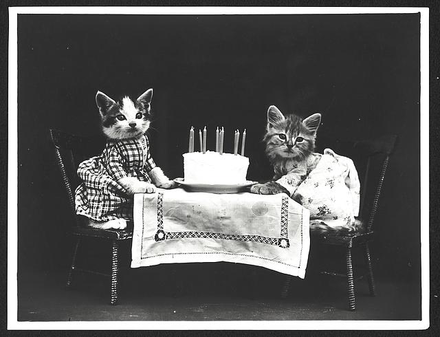
The Birthday Cake - Frees, Harry Whittier
3.3 Construct and analyze markup that implements navigation #
- Anchor: The anchor "a" element is used to create a hyperlink that can direct a user to a different web page or to a different spot on the same web page. The "HTML Reference" attribute with the attribute name of "href" contains the address for the hyperlink as its attribute value. The content of the "anchor" element should clearly indicate the destination of the hyperlink.
- target: The "target" attribute is used in the "anchor" element to specify where the hyperlink will open. There are several valid values for this attribute, but the two this exam are concerned with are "_self" and "_blank". The default place for a hyperlink to open is in the current tab/window the user is currently in, this is "_self". Sometimes however, we would like to keep the user on our page and have the hyperlink open in a new tab/window, in which case we use "_blank". Below is an example of the "anchor" element with the "target" attribute set to the "_blank" value.
- Bookmarks: Bookmarks are hyperlinks that direct the user to a different location on the current document. This is very useful if the document is long (like this study-guide for example). To create a bookmark, first, give the element where you would like the hyperlink to direct to an ID with the "id" attribute. Second, create an "anchor" element and write the ID in as the value for the "href" attribute. See the example below.
- Relative vs. Absolute Links: A hyperlink can have two general destinations. One, relative: a link that references a location based on its relation to the current document. Two, absolute: a link that references a specific URL address. A relative link will typically be the name of the file, such as "contact.html" or "index.html". An absolute link is a specific web address such as "https://www.example.com".
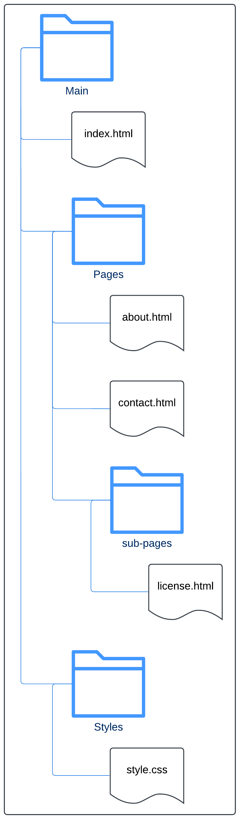
-
Navigating Simple Folder Hierarchies: Relative hyperlinks are very simple if all of the
documents are in the same folder/directory, however, larger
websites are often organized using many folders. Use the
example below to note the four different ways links are
written in the "href" attributes. The folder diagram on the
right is a visual representation of the contents of the
folders that exist on this example website. The code on the
left is for the "about.html" page in the "pages" folder.
- On line 14, we see the simplest link as mentioned earlier. Because "contact.html" exists in the same folder, the link is simply written as its name.
- On line 11, we see that to go up one folder in the directory two dots and a forward slash (../) must be written before the name of the file. Because "index.html" exists in the folder above, the link must be written as "../index.html".
- On line 17, we see that to go down a folder we write the name of the folder below, then a forward slash. Because "license.html" is in a folder called "sub-pages", and that folder is in the same folder as the current page, we create the link as "sub-pages/license.html".
- On line 5, we see that to go up a folder then into a different folder we combine the two previous ideas. We write two dots to go up a folder, then write the name of the folder in the folder above that holds the file we are looking for, then the file name. Because "style.css" is in a folder above called "styles", we write the link as "../styles/style.css".
- map, area: The "map" element, along with the "area" element, allows for the creation of images that have spots on them that can be clickable hyperlinks. You'll see in the example below that the "map" and "area" elements can be quite complex. For the exam, all you need to remember is what these elements do and that the "area" element must be nested inside the "map" element. The movie screen is the clickable area of the image in the example.
3.4 Construct and analyze markup that uses form elements #
Forms are the primary method for getting user input on a web page. If you have ever made an account on a web page, you have interacted with a form. Forms have text boxes, drop-down menus, buttons, check-boxes and much more. Forms send their input to a database. This exam does not assess our knowledge about databases, so we will only cover the bare minimum about this process.
- Form Attributes: In the "form" element we use two attributes, "action and "method". The "action" attribute allows us to type a URL as its value. This URL is the page that processes the user input for the form. The "method" attribute specifies how the user input will be sent. The example below shows a simple form. Note that this form will not work correctly because a database server is not running to receive and process the input.
- Submission Methods: in the example above you will see that the value for the "method" attribute was "POST". There are two main submission methods and they are "GET" and "POST". "GET" is a request to retrieve information from the database server, such as search results or images. Note that with "GET" the data from the form will be shown in the URL. "POST" is a request to modify information on the database server such as changing a password.
-
Input Types and Restrictions: as you can imagine, there are a lot of different ways we
can collect input from users. We will only cover some of the
basic ones here, but if you'd like, here is a more
comprehensive list of examples. As mentioned earlier, we can have simple inputs like
text, and checkboxes, but we can also have more complex
inputs that restrict what the user may write. For example,
below you will see an "email" and "password" input. The
"email" input will only allow valid email addresses as
input, and "password" will mask what the user types,
typically with dots or stars so other people cannot see the
input.
- label: The "label" element creates a caption for an input. All inputs should use the "label" element and not the "paragraph" element. The "label" element is important for accessibility, as assistive technology depends on these labels to help users to fill out forms. Also, the label can be clicked to select the input that is associated with it. This helps users to understand what data should go in which input if they are confused by the layout of the form. To associate a label with an input, make sure to write the same value in the "for" attribute in the "label" element as the "id" attribute in the "input" element.
- text: When the "type" attribute has a value of "text" in an "input" element a single-line text-box will appear. You can see this on line 9 of the example above. In the example it is being used to take in a Username from the user.
- password: When "password" is used as the value, a text box is created just as with "text", but any input into the box is hidden to protect the user's data. In the example above, this is created on line 11.
- email: When "email" us used, a text box is created, but when the form is submitted the page will check if a valid email address was entered. If not, the form will not submit and the user will be prompted to fix their input. In the example above, this is created on line 13.
- select: Unlike the previous input types, "select" is its own element, not an attribute value for the "input" element. The "select" element creates a drop-down box from which the user can select from a list of options. In the example above, the "select" element is started on line 15, ended on line 20, and has the user select from a list of time zones.
- option: the "option" element nests inside of the "select" element and is used to create an item for the drop-down box. In the example, the "timezone" options are created on lines 16-19.
- textarea: The "textarea" element is like the "input" element with the "type" attribute set to "text", but with a multi-line text box. the "textarea" element has a "cols" attribute for setting how many columns wide the box will start with when the page loads, as well as a "rows" attribute for setting how many rows tall the box will start with. The user can resize the box by dragging the bottom right corner. In the example above, this is created on line 23.
- button: The "button" element creates a button that the user can click to initiate some action on the form. On line 26 a button was created with the "type" attribute set to a value of "reset" which resets all of the form input to their default values. Notice that on line 25 there is an "input" element with the "type" attribute set to "submit". This also create a button that submits the form data. The "button" element could also have been used here instead to achieve the same thing.
4.0 Multimedia Presentation using HTML #
4.1 Construct and analyze markup that displays images #
- img: The "img" element allows us to add images to a web page.
- src: The value in the "src" attribute is where we write the source for our image. While the source can be either a relative or an absolute link, it is best to always use absolute links. This way, we don't have to worry if another website is down or deletes the image.
- alt: The "alt" attribute is for writing a text description that is capable of replacing the image. Not all browsers show images. Some browsers read text to people with visual impairments, others have images turned off for people with slow internet connections. For these reasons it is very important to always have a good description in the "alt" attribute.
- width and height: the "width" and "height" attributes specify the dimensions of the images. There are many units that are supported, but "px", i.e. pixel is the most popular.

- picture/source: The "picture" element allows us to display a different image depending on the display. This is very useful for "responsive" design, which is the process of creating a website that adapts its layout for different sized screens (phones, tablets, desktops, etc.). The "source" element nests inside of the "picture" element and describes the images that will be used in the spot on the page. The "media" attribute allows us to specify at what screen width the image should display, and the "srcset" attribute allows us to link the image that will be displayed.
4.2 Construct and analyze markup that plays video and audio #
- video: The "video" element is used to insert a video into a web page. Much like the "picture" element, "video" uses nested "source" elements to specify the video we'd like to use. We can also write some fallback text if the user's browser does not support videos.
- autoplay: The "autoplay" attribute can be added to the "video" element's start tag if you'd like the video to play when the page loads. Note that "autoplay" does not have a value so we do not need to include the equal sign or quotation marks (=""). This also applies to the next two attributes mentioned below.
- controls: The "controls" attribute can be added to the "video" element's start tag if you'd like the user to see the play/pause button, volume slider, and seek bar. It is a good idea to always add this attribute as user's appreciate the ability to control the video.
- muted: The "muted" attribute can be added to the "video" element's start tag if you'd like the video to start with muted volume. This is a good idea to add if you choose to include the "autoplay" attribute, as users find it annoying to have sound playing the moment a page loads.
- track: The "track" element is used to add closed-caption text to the video. the "src" attribute must link to a .vtt file which is a text file that allows the captions to be programmed to show at the time in the video when they are appropriate.
- audio: The "audio" element is used to insert a audio into a web page. Much like the "picture" element, "audio" uses nested "source" elements to specify the audio file we'd like to use. The "audio" element can include all of the same attributes and the "track" element as mentioned under the "video" element above.
- iframe: The "iframe" element allows us to embed another web page into our web page.
5. Webpage Styling using CSS #
5.1 Construct and analyze styles that position content #
-
position: Positioning refers
to the placement of elements on a page, and is done inside a
CSS ruleset with the "position" property. By default, all
elements have "static" position value which means they flow
from top to bottom and left to right, just like in a book or
magazine. Of course, there are many options to change the
positioning of elements to design some very creative and
beautiful web sites.
Relative
Absolute
Static
- relative: If the "position" property is given the value of "relative", the element stays in within its normal flow on the page, but can be moved in relation to where it would have been. Notice in the example above that the cyan div where it would normally be, but moved slightly to the right. Also, the elements below it flow as expected.
- absolute: If the "position" property is given the value of "absolute", the element is removed from the flow of the page and is positioned relative to its closest ancestor. Notice in the example above that the magenta div is roughly where it would be normally, but is centered in the preview box, because we chose a value of 50% of the width of the preview box. Also, the element below was moved up because positioning "absolute" removed the div from the normal flow of the page, so now it looks as if the magenta element is stacked on top of the yellow element.
- static: The default value for the "position" property is "static" and positions elements from top to bottom on the page. Notice in the example above that despite specifying a 50px gap on the left of the yellow div, it did not move from where it would normally be. Elements that are "static" cannot be moved in this way.
- fixed: If the "position" property is given the value of "fixed", the element is removed from the flow of the page and is positioned relative to viewport. This means that the element will stay exactly where it is, even if the user scrolls up and down the page.
- float: The "float" property will remove an element from the static flow of the page and move the element to the left, with a value of "left", or right, with a value of "right". Notice in the example below how floating the cyan div to the left and the magenta div to the right affects the yellow div. It was placed in the center, and now all of the divs are at the top of the page instead of each one going below the next.
- height/width: The "height" and "width" properties set the size of elements. By default, these are set to auto and will grow or shrink to fit the content. Notice the example below.
- max-width/min-width: "height" and "width" will set a specific size, but if we'd like our elements to still grow and shrink, but stay within a minimum and maximum range, we can use the "min-width" and "max-width" properties. Notice in the example below that if you grow/shrink the "text-area" element, the cyan element will grow and shrink to fit in the space to the right, but it wont get any larger than 60 percent of the width of the example box. Also, if the "text-area" gets so wide that the cyan element becomes less than 20 percent of the width of the example box, it will jump down below the "text-area" element as it cannot become that small.
- overflow: When we restrict the size of elements with "height", "width", "max-height", or "min-height", if the content becomes larger than the size of the element, it will "break" through the element. This looks terrible and must be avoided. The "overflow" property allows us to create a scroll-bar so the content stays within the element. Notice in the example below, both the cyan and magenta elements were given specific dimensions, but the magenta element has its "overflow" property set to "auto", while cyan's was left as the default value. This causes the text in the cyan element to overflow through the bottom, while the magenta element gets a scroll-bar.
- text-align: The "text-align" property, much like on a word processor, allows us to align text to the left (the default setting), right, center, or it can be justified (equal space between each word). Notice in the example below how each element has a different "text-align" value and the affect it has on the text inside.
- display: The "display" property allows us to change whether an element shows as "inline" or as "block". A "block" takes up the entire width of its ancestor and ends with a line break so the next element goes under it, such as the "paragraph" element. An "inline" element is always the exact size to fit the content within and no larger. It does not end in a line break, so the next element will go to the right of it. "span" is an "inline" element. "display" can also be set to "none" effectively removing the element from the page. Notice in the example below, the cyan and yellow elements have the "display" set to "block" and the pink element has its "display" set to "inline". Also notice how the magenta element has been removed because its "display" is set to "none" and how this is different from how it is hidden in the next example.
- visibility: The "visibility" element allows us to hide and show elements. Elements with their "visibility" set to hidden still take up space as if they where "visible" The user just cannot see them, where "display: none;" will hide the element and delete the space it was taking up on the page.
-
The Box Model: The Box Model
refers to how each element shows on a page. Every element is
a rectangle or "box" that has four components: margin,
border, padding, content.
- margin: The "margin" property of an element describes how much space exists around the element between its border, and the margin of surrounding elements.
- border: The "border" property of an element describes how much space exists between the element's padding and its margin. This border can be styled to be a different color, shape, etc.
- padding: The "padding" property of an element describes how much space exists between the an elements border and its content.
- Content: An element's content does not exist as a CSS property, but simply refers to what the element is displaying. Content is typically text, images, pictures, video, or audio.
Float left
Float right
No float
Small
Medium
Large
Lorem ipsum dolor sit amet consectetur adipisicing elit. Nobis excepturi omnis sint explicabo quisquam et rerum, molestiae temporibus fuga est ea architecto quia nihil laboriosam dicta recusandae ut consectetur! Excepturi!
Overflow Left On Default:
Lorem ipsum dolor sit amet consectetur
adipisicing elit. Nobis excepturi omnis sint
explicabo quisquam et rerum, molestiae
temporibus fuga est ea architecto quia nihil
laboriosam dicta recusandae ut consectetur!
Excepturi!
Overflow Set To Auto:
Lorem ipsum dolor sit amet consectetur
adipisicing elit. Nobis excepturi omnis sint
explicabo quisquam et rerum, molestiae
temporibus fuga est ea architecto quia nihil
laboriosam dicta recusandae ut consectetur!
Excepturi!
Overflow Left On Default:
Lorem ipsum dolor sit amet consectetur
adipisicing elit. Nobis excepturi omnis sint
explicabo quisquam et rerum, molestiae
temporibus fuga est ea architecto quia nihil
laboriosam dicta recusandae ut consectetur!
Excepturi!
Text Align: Default:
Lorem ipsum dolor sit amet consectetur
adipisicing elit. Nobis excepturi omnis sint
explicabo quisquam et rerum, molestiae
temporibus fuga est ea architecto quia nihil
laboriosam dicta recusandae ut consectetur!
Excepturi!
Text Align: Center:
Lorem ipsum dolor sit amet consectetur
adipisicing elit. Nobis excepturi omnis sint
explicabo quisquam et rerum, molestiae
temporibus fuga est ea architecto quia nihil
laboriosam dicta recusandae ut consectetur!
Excepturi!
Text Align: Right:
Lorem ipsum dolor sit amet consectetur
adipisicing elit. Nobis excepturi omnis sint
explicabo quisquam et rerum, molestiae
temporibus fuga est ea architecto quia nihil
laboriosam dicta recusandae ut consectetur!
Excepturi!
Text Align: Justify:
Lorem ipsum dolor sit amet consectetur
adipisicing elit. Nobis excepturi omnis sint
explicabo quisquam et rerum, molestiae
temporibus fuga est ea architecto quia nihil
laboriosam dicta recusandae ut consectetur!
Excepturi!
This cyan element is displayed as a "block" element. This pink "span" element displays as "inline". You cannot see the magenta element below because its "display" is "none".
You can't see this text.
This is another "block" element that has moved up to fill the space of the element with "display" set to "none".
This element is above an invisible element.
You can't see this text.
This element is below an invisible element.
5.2 Construct and analyze styles that format text #
- font-family: The "font-family" property allows us to create a list of fonts that we would like to display on the page. The browser will try to load the first font in the list, if it cannot load that font, it will try the next one. Notice in the example above how the first sentence has the first value in "font-family" set to "Times New Roman".
- color: The "color" property sets the color of the text. The color can be set using red, blue, green (RGB) color codes, hexadecimal (HEX) color codes, or with simple color names such as "red", "purple", or "orange". Notice in the example above how the first sentence has its color set to "forestgreen".
- font-style: The "font-style" property allows us to set the font to display as italic. Notice in the example above how the third sentence has its "font-style" set to "italic".
- font-size: The "font-size" property allows us to set the size of the font. There are many units for font sizes, but the most popular are pixels (px), points (pt), and em quadrat (em). We will go into more detail about units later. Notice in the example above how each sentence is larger than the last because of the use of the "font-size" property.
- font-weight: The "font-weight" property allows us to set the font to display as bold. Notice in the example above how the second sentence has its "font-weight" set to "bold".
- text-decoration The "text-decoration" property allows us to underline or overline text. Notice in the example above how the second sentence has its "text-decoration" set to "underline".
- font-variant: The "font-variant" property allows us to set text to "small-caps". This makes all of the text uppercase, but makes lowercase letters smaller than uppercase ones. Notice that in the example above the fourth sentence has its "font-variant" set to "small-caps".
- text-indent: The "text-indent" property allows us to indent the first line of a paragraph. A style popular with MLA formatted essays. Notice how the cyan element above has a "text-indent".
- line-height: The "line-height" property allows us to set the spacing between lines of text in an element. Notice how the magenta element has its "line-height" changed to "2em".
- word-wrap: The "word-wrap" property allows us to break words that usually would not be broken, and put them on a new line if they are larger than the parent element they are inside of. Notice that the yellow element has "word-wrap" set to "break-word". Normally the really long word that is in the element would break through, but this setting has prevented that.
- letter-spacing: The "letter-spacing" property allows us to set the spacing between letters in an element. Notice that the orange element has its "letter-spacing" set to "0.5em" and the letters are much further apart as a result.
The quick brown fox jumps over the lazy dog
The quick brown fox jumps over the lazy dog
The quick brown fox jumps over the lazy dog
The quick brown fox jumps over the lazy dog
Text Indent:
Lorem ipsum dolor sit amet consectetur adipisicing elit.
Nobis excepturi omnis sint explicabo quisquam et rerum, molestiae temporibus fuga est ea architecto quia nihil laboriosam dicta recusandae ut consectetur! Excepturi!
Line Height:
Lorem ipsum dolor sit amet consectetur
adipisicing elit. Nobis excepturi omnis sint
explicabo quisquam et rerum, molestiae
temporibus fuga est ea architecto quia nihil
laboriosam dicta recusandae ut consectetur!
Excepturi!
Word Wrap:
Here is a
reeeeeeeeeeeeeeeeeeeeeeeeeeaaaaaaaaaaaaaaaaaaaaaaaaaaaaaalllllllllllllllllllllllllllllllllyyyyyyyyyyyyyyyyyyyyyyyyyyyyyyyyyyy
long word.
Letter Spacing:
Lorem ipsum dolor sit amet consectetur
adipisicing elit. Nobis excepturi omnis sint
explicabo quisquam et rerum, molestiae
temporibus fuga est ea architecto quia nihil
laboriosam dicta recusandae ut consectetur!
Excepturi!
5.3 Construct and analyze styles that format backgrounds and borders #
Lorem ipsum dolor sit amet consectetur adipisicing elit. Nobis excepturi omnis sint explicabo quisquam et rerum, molestiae temporibus fuga est ea architecto quia nihil laboriosam dicta recusandae ut consectetur! Excepturi!
Lorem ipsum dolor sit amet consectetur adipisicing elit. Nobis excepturi omnis sint explicabo quisquam et rerum, molestiae temporibus fuga est ea architecto quia nihil laboriosam dicta recusandae ut consectetur! Excepturi!
Lorem ipsum dolor sit amet consectetur adipisicing elit. Nobis excepturi omnis sint explicabo quisquam et rerum, molestiae temporibus fuga est ea architecto quia nihil laboriosam dicta recusandae ut consectetur! Excepturi!
Lorem ipsum dolor sit amet consectetur adipisicing elit. Nobis excepturi omnis sint explicabo quisquam et rerum, molestiae temporibus fuga est ea architecto quia nihil laboriosam dicta recusandae ut consectetur! Excepturi!
- border-color: The "border-color" property allows us to change the color of an element's border. Note that the border's style must be changed first, as its default style value is "none" which hides the border.
- border-style: The "border-style" property allows us to change the type of border for an element. Borders can be solid, dashed, dotted, etc.
- border-width: The "border-width" property allows us to change the thickness of the border for an element.
- background: The "background" property allows us to change what shows inside the border area of an element, and can be set to a color or it can be a picture.
-
Colors: Earlier we discussed
the different ways we can specify colors in CSS. Below are a
few more details regarding color in CSS.
- Named Colors: Most of the code examples in this study guide have used color names. The good thing about color names is they are very easy to remember and write, but the downside is they are very limited as there are only about 160 of them. Here is a full list of HTML color names.
- Red, Green, Blue (RGB) Codes: RGB codes are a series of three numbers that mix together to a color. The first number represents how much red the color contains, the second represents green, and the third one is for blue. The numbers go from 0 to 255, where the lower the number is the less of that color will be mixed in. For example, yellow would be a mix of red and green and would be written like this "rgb(255, 255, 0)" With just these three colors and values, we can make over 16 million colors. Many more than with the color names.
- Hexadecimal (HEX) Codes: HEX codes are a hexadecimal (base 16) representation of RGB codes. Like RGB codes, HEX codes use a mix of red, green, and blue to make colors, but instead of values between 0 and 255, they use the hexadecimal values between 00 and ff. All HEX color codes start with the hash-tag symbol (#). Using this syntax, the yellow we made using RGB would look like "#FFFF00" in HEX. This may seem confusing if this is your first time reading hexadecimal numbers. There will be a hexadecimal guide on this website in the future, but for now you can read this guide.
5.4 Construct and analyze styles that create a simple responsive layout #
-
Units: Like colors, there are
many ways to specify how large something is on a page. Units
are broken into two categories: absolute and relative.
Absolute
units never change as they are what they are, such as
"inches", where relative units are based on the size of
something else, such as "%".
Relative
units are the preferred units to work with in HTML/CSS
because they allow us to create pages that look good on
devices both large and small. A few of the more popular
units are explained below.
-
Absolute
- px: Pixels (px) are units that describe the tiny squares of light that make up a screen. Because screens can have many different pixel configurations, this can be a difficult unit to work with for aligning content.
- pts: Points (pt) are technically defined as being 1/72 of an inch, but what is important to remember is that it is similar to its usage in a word processor for working with fonts (12pt font, 14pt font, etc.).
-
Relative
- em: Em quadrat (em) is a unit that is relative to the default size of the font being used. So, a font that has its "font-size" set to "2em" will display as two times larger than fonts at "1em".
- vw/vh: Viewport width (vw), and viewport height (vh) are units relative to 1% of the width and height of the current viewport. This is useful for making elements grow or shrink with the browser window they are using.
- %: Percent (%) is a unit that is relative to the size of the parent element. This is useful for sizing and positioning elements that are nested inside of a div.
-
Absolute
- viewport: "viewport" is not a CSS property, but instead a value for the "meta" element's "name" attribute. The important thing to remember is that the code in the example changes the width of our pages to fit the width of the user's screen. This is useful because users may view our page on their phones, tables, laptops, or desktops, and these all have very different widths.
- Media Query and Break Points: Media queries allow us to choose different style rulesets for different states of the user's device. For example, we can detect if a phone is in portrait mode, then make a row of pictures display as a column instead. These different media query rules are called "breakpoints" as they break our rulesets into chunks based on the user's device. Notice the example below. The CSS code in the top-right window shows the four "rect" divs as having colored backgrounds, 25% width, and they have their "float" property set to "left" making them display in a row. If you look at lines 25-29, however we see that if the screen becomes 1000px wide or less their "float" property is set to "none", making them display in a column. This is perfect for making layouts that look good on both portrait monitors and landscape phones. Try adjusting your browser window to see the effect.
- Grids: One modern CSS feature that makes laying out web pages easier is "grids". Grids act as a table, but instead of holding data, they hold elements such as divs that can be organized into neat rows and columns. This removes the frustration of having to align everything by constantly adjusting the margin and padding for every element. These grids can be reorganized very easily using the media queries mentioned earlier to make the page look good across many devices. There are many ways to configure the grid system, but for this exam you only need to know its definition, functionality, and basic syntax shown in the example below.
Lorem ipsum dolor sit amet consectetur adipisicing elit. Nobis excepturi omnis sint explicabo quisquam et rerum, molestiae temporibus fuga est ea architecto quia nihil laboriosam dicta recusandae ut consectetur! Excepturi!
Lorem ipsum dolor sit amet consectetur adipisicing elit. Nobis excepturi omnis sint explicabo quisquam et rerum, molestiae temporibus fuga est ea architecto quia nihil laboriosam dicta recusandae ut consectetur! Excepturi!
Lorem ipsum dolor sit amet consectetur adipisicing elit. Nobis excepturi omnis sint explicabo quisquam et rerum, molestiae temporibus fuga est ea architecto quia nihil laboriosam dicta recusandae ut consectetur! Excepturi!
Lorem ipsum dolor sit amet consectetur adipisicing elit. Nobis excepturi omnis sint explicabo quisquam et rerum, molestiae temporibus fuga est ea architecto quia nihil laboriosam dicta recusandae ut consectetur! Excepturi!
6. Accessibility, Readability, and Testing #
6.1 Construct well-formed HTML and CSS markup that conforms to industry best practices #
- Reusing rules and rule sets: As mentioned previously, CSS rules and rulesets can be reused throughout a page, and across multiple pages in a website using an external stylesheet. This is the preferred method for many reasons. Doing it this way makes writing the same styles easier, faster and more consistent as we don't have to write the same thing multiple times.
- Commenting: Comments are text written into the code that is ignored by the browser. This allows us to write messages in the code to ourselves and other programmers. It also allows us to test multiple versions of an element or ruleset. To do this, we can write the code for the multiple versions and turn the ones we do not want to show into comments. Then we can switch the comments to try out the other versions. As we can see in the example below, an HTML comment starts with "<!--" and ends with "-->". Anything between these two series of characters will be ignored by the browser. A CSS comment starts with "/*" and ends with "*/".
-
Web-Safe Fonts: Many web
pages use custom fonts which must be downloaded when the
page loads. However not every browser can download fonts and
some users turn this feature off to save bandwidth.
Therefore, it is important to always add a web-safe font to
the "font-family" property in your CSS. The most common
web-safe fonts are listed below.
- Arial (sans-serif)
- Times New Roman (serif)
- Courier New (monospace)
- Cross-Platform Usability: Because different browsers interpret HTML and CSS slightly differently, it is very important to test your web pages on as many different browsers and devices as possible.
- Separation of Structure (HTML) and Style (CSS): While CSS can be written inline and internal, it is always best practice to write external stylesheets. This makes the HTML code cleaner because the CSS is written in a different file. It also makes the styling more consistent as one ruleset can be applied to multiple elements, mentioned earlier.
Hello
Foo
Bar
6.2 Apply accessibility principles and evaluate content accessibility #
- Text Alternatives: Remember to always write descriptive text in the "alt" attribute for visual and audio content as this helps people with vision and hearing disabilities.
- Color Contrast: Remember to have contrasting colors on a web page any time two elements are next to or on top of one another. For example, the background color and text color should contrast or it will be difficult to read the text. A bright yellow text would be hard to read on a white background, while dark-green text would be more legible.
- Legibility of Typography: Some fonts, particularly handwritten or "script" fonts, can be difficult to read for many users. When choosing a legible font, check that lowercase l, uppercase I, and the number 1 look different (lI1), as well as lowercase o, uppercase O, and zero 0 (oO0). Attention should also be paid to line and character spacing. Text can be difficult to read if it is too close or far away from other text.
- Tab Order: Some disabilities make it difficult to use a mouse. This can make it hard to navigate links and forms. For this reason it is important to make sure the order that elements are selected when pressing the "TAB" key makes sense. The "tab-index" attribute can be added to any element to manually set the tab order. Elements should be in tab order from left-to-right, then top-to-bottom, just as we read text in a book.
- Text Hierarchy: Web pages should always be laid out in a logical order. While the heading elements "h1" - "h6", make text bigger and bolder they should not be used solely for this purpose. Heading elements represent a page's hierarchy. This means that if we use an "h1" in the "header" to represent a title for the whole page, we should never use "h1" for any other content, as nothing on the page would have the same hierarchy as the page's main title. However, if a page has multiple blog articles, and each article has their title nested inside of an "h4", this is perfectly acceptable, as each blog article's title has the same logical hierarchy.
- Translation: Many modern browsers have the ability to translate text inside of a web page. While there is an attribute that can be applied to the "meta" element to disable translations, we should avoid using it as language translation is a very helpful accessibility feature for people who cannot read the language that our page was written in.
6.3 Evaluate the structural integrity of HTML and CSS markup #
- Syntax Errors: Syntax errors are mistakes in the code that prevent it from running correctly. The most common HTML syntax error is forgetting to add end tags. The most common CSS syntax errors are forgetting the curly brackets "{}" in a ruleset, and mixing up the colon ":" and semicolon ";".
- Tag Mismatch: Another common error in HTML is to mismatch tags. Elements should have their start and end tags organized like a sandwich. If a "span" element is nested inside a "p" element, the order of the tags should be <p><span></span></p>.
- Cascading Issues: Another common CSS issue is cascading issues. This is when one element is being styled by multiple rulesets. Having a good understanding of CSS precedence (mentioned in domain 2.1) can help to troubleshoot these issues.